Book design project: Navigating Change
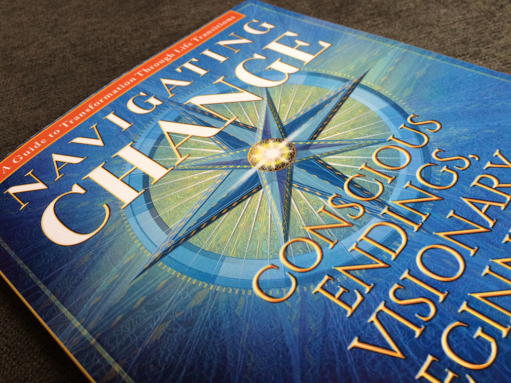
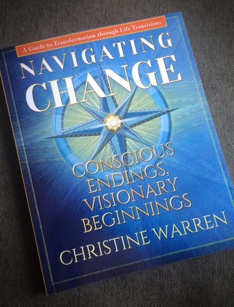
One of my recent book design projects is Navigating Change (Flame Lantern Press). This was a fun project and it was a great pleasure to work with the author, Christine Warren. This book, as I will show, illustrates some important things to consider when designing a book.
Christine is a presenter of transformational workshops, a consultant, life coach, and speaker. Her book brings together teachings, stories, and tools to help people move through life’s changes or transitions. In her words, the goal is to help people move through “life transitions with magnificence.”
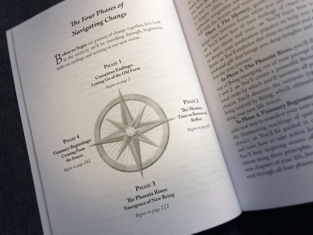
Her book shares the principles and practices found in her workshops. Her presentation is divided into four phases represented by the four points of the compass in this diagram.
Put in the simplest way, two main concepts converge in Christine’s book—navigating and wisdom.
I put together various cover designs and from those options, Christine chose the compass concept. There are all sorts of books that use a compass on the front cover, so it was crucial to create one that was as unique and original as possible. Generally speaking, compasses have masculine associations, so the additional challenge was to re-envision the compass idea in a way that would balance both masculine and feminine to resonate with her inclusive audience.

The spiritual themes in the book led me to draw inspiration from Gothic rose windows to develop the unique compass needed for the cover. How the two merge isn’t entirely obvious, but the end result has the desired effect. The compass art is worked into a series of translucent layers with a floral lattice-like pattern for the background, plus light effects and a small rose-window-like design at the center, which together transform the compass. The result is a visual image that helps communicate her concept “Conscious Endings, Visionary Beginnings.” It needed to be subtle so as to not be too Western because the wisdom in the book draws on both eastern and western ideas and sayings.
The cover design is carried over to the interior pages by using the compass art for a diagram in the introduction, for the four phase-opening pages and a smaller compass for the sections within each phase.
In manuscript form, most books are just pages of paragraphs with very few other features. Put together in a small format with no special features a book can be uninteresting and more difficult to read. Unfortunately, too many books are produced that way. And that simply would not do for a book that aims to inspire readers. So I was very happy that the author wanted to take this book to a higher level.
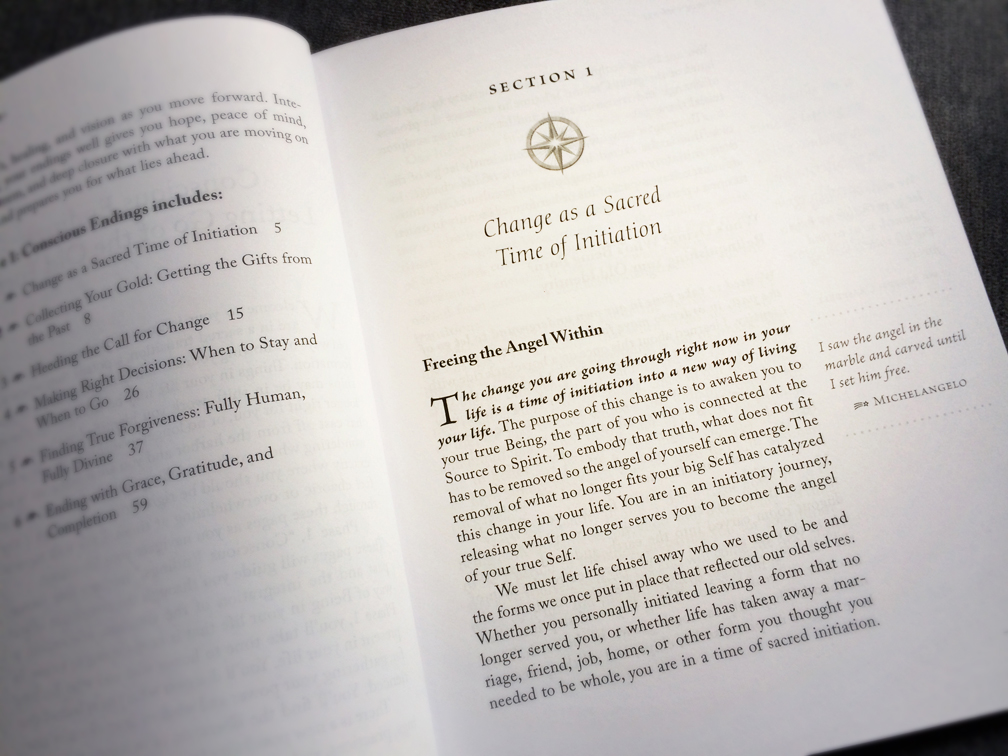
This is where design makes a difference. To make the book beautiful, as well as reader friendly, the main text is set on large format pages (7.5”x9.25”) with a generous margins and 12pt type. This allows for some of the content to be moved from the main text into the outer margins—such as special quotes and poems, as well as pull quotes from the main text.
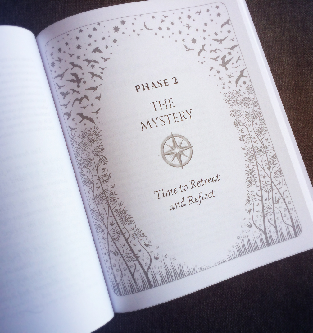
I also created original decorative art used for each of the four right-hand phase openers. This helps the four phases openers stand out and makes the book easier to navigate because each of the four phases can be easily located. The art is an illustration consisting of small flowers, delicate trees, birds, and stars. The idea is simple—to visually communicate how life is interconnected, one of the reoccurring themes in the book.
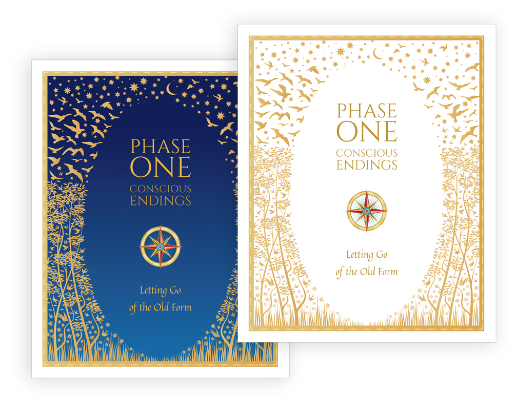
“Michael is deeply involved with his authors and cares passionately about not only the beauty of the physical books, but their success… His patience, attention to detail, and work exceeded my greatest expectations. He is deeply knowledgeable about the publishing world and has a wealth of information to help his authors succeed… There are many people out there offering book design services, but not the caliber of Michael Rohani. I could not be more pleased with the end results of our work together.” —Christine Warren
Need a Book Design? Start with these Questions:
When you are thinking about the art direction of a book cover, start with these five basic questions:
- The concept: What concept best represents the central idea in the book? The visual concept should fit with the title of the book.
- Product differentiation: Will the design stand out when compared to other books in the same category?
- Readability: Will the cover idea be clear when the cover is shown in small sizes on the internet and in ads?
- Memorability: Will the design be recognizes and remembered.
- Audience: Will the design appeal to the author’s intended audience?
There are lots of other important questions and issues to consider, such as print options, keyword strength (discoverability), cover copy (use of endorsements, book benefits description, the author bio), retail requirements, BISAC, etc. For this blog post, I just want to focus on the book design.
The design is the first step for communicating what the book is about and for whom it is intended.
It can also make an important difference to how a book is noticed and remembered and the purchase decision. People like books that have a good user experience. If for example, the type or margins are too small, some buyers, without even knowing why, may decide they are unlikely to enjoy reading the book. The more competition there is, the more design becomes important.