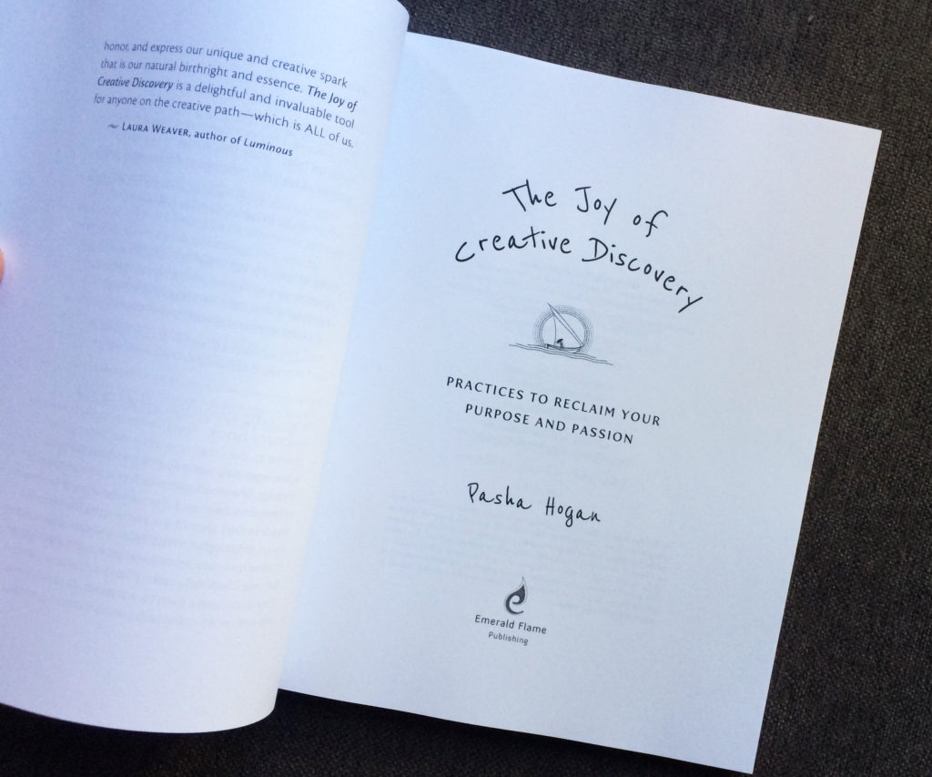
It is really exciting to work with authors and independent publishers who care about quality and the reader experience. Pasha Hogan’s new book, The Joy of Creative Discovery definitely falls into that category. This book is an engaging collection of interesting activities, writing prompts, art projects, nature excursions, stress-reduction techniques, and much more—all carefully put together by the author to help those who are journeying through difficulties or anyone who wants a happier life.
I first met the author a few years back when I designed her book, Third Time Lucky, an inspirational account of her journey of transformation following a third cancer diagnosis. It includes her insights for living “beyond life challenges.” Her new book builds on the groundwork of her life and experiences helping others get through similar difficulties.
From a book design point of view, this book shows that, even with only a black and white interior, a book can be fun, imaginative, and engaging.
I really believe that book design should draw the reader in and add to the whole pleasure of reading the book.
Obviously, the approach used for The Joy of Creative Discovery wouldn’t work for all books. I design many business books that require an entirely different approach. But in this case, the author’s writing and content, and her openness to creativity allowed this beautiful book to happen.
This project provided me an opportunity to use both my design and illustration skills. The content and book title—“The Joy of Creative Discovery”—is perfect for visual representation. The cover illustration depicts a confident and capable woman, that we can rightly assume is the author, navigating uncertain waters that represent the journey of life. The illustration depicts an open expanse of rolling sea waves, clouds, a setting sun, and star-filled celestial realms above as well as the real and mystical creatures large and small that inhabit these layers of creation.
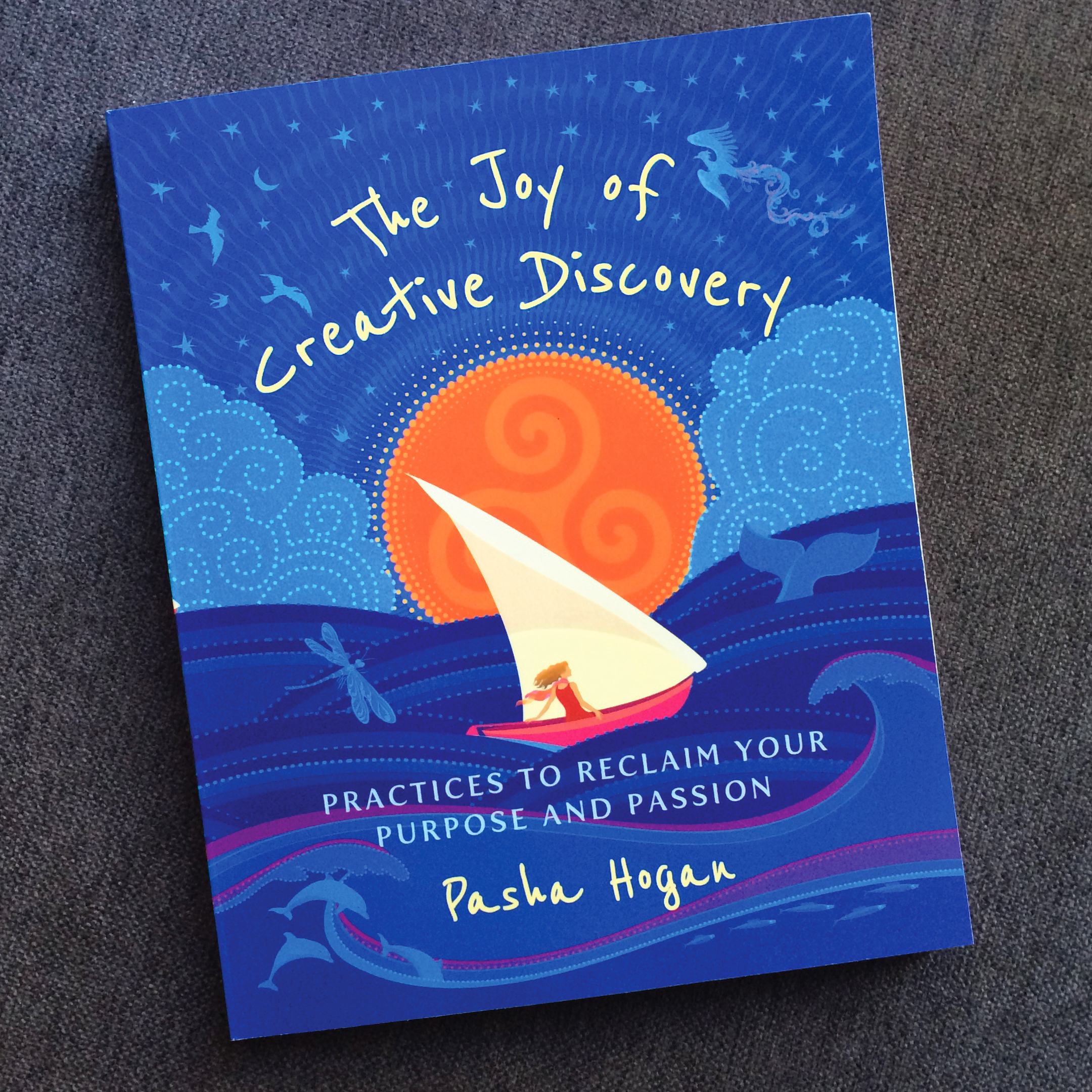
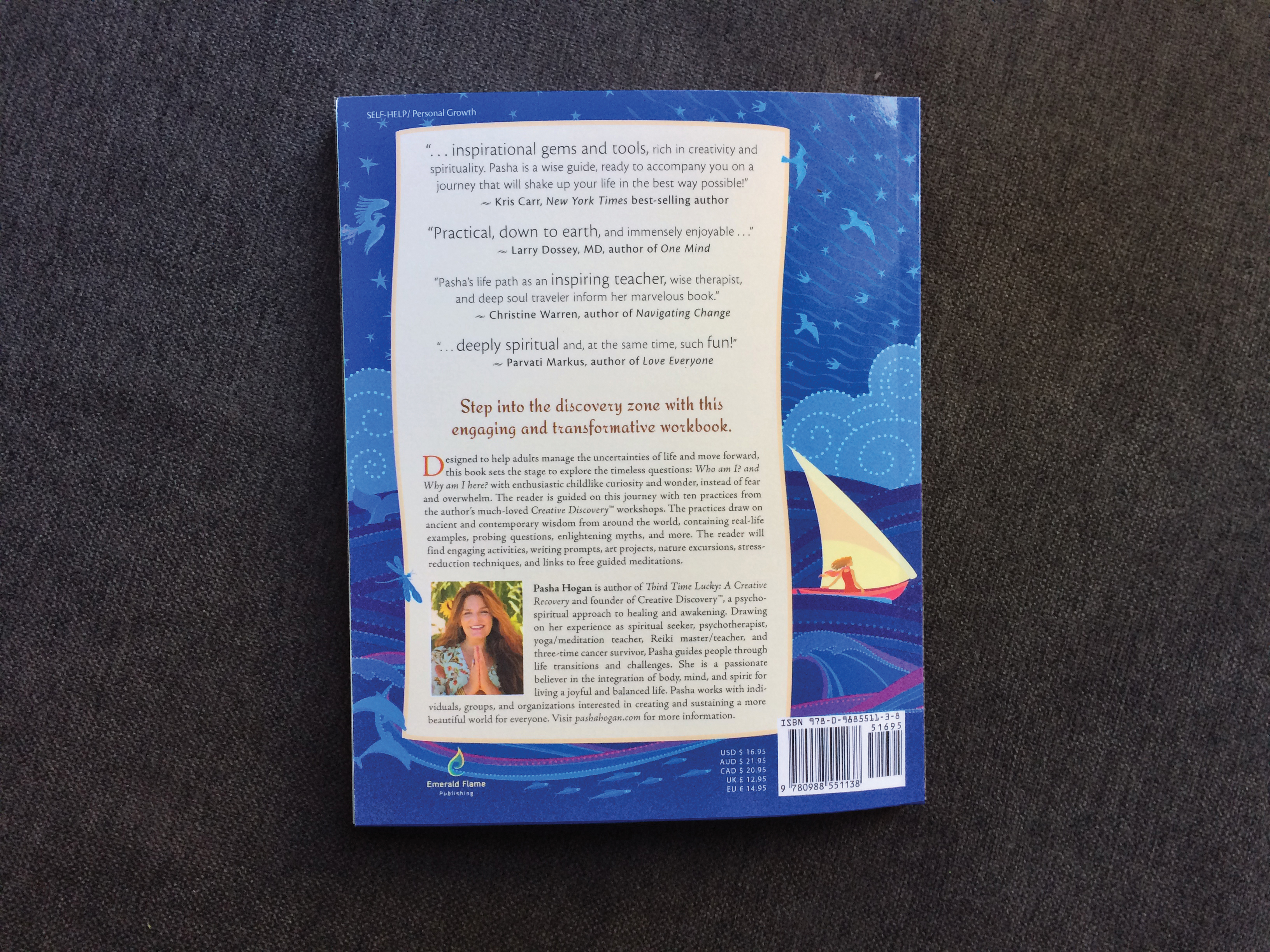
These diverse cover elements could then be pulled from the illustration to support the different content features in the book. Knowing in advance that the book would be printed in B&W, I used a line-art illustration style that would produce clear results for that print method.
The interior of the book included four main reoccurring features or information categories — “Playtime,” represented by birds (swifts); “Map It,” represented by the sailboat; “Treasure the Moment,” represented by a whale tale; and “Practice,” represented by three jumping dolphins.
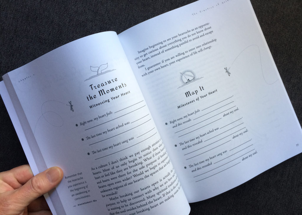
In addition to these categories, additional birds, the Phoenix, and especially the dragonfly reappear randomly throughout the book. There are also a few unique illustrations created in a matching style for special content and projects.
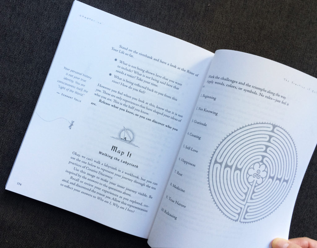
Together, these line-art illustrations create design continuity between the pages and cover concept. And more important, they add joy and creativity to the reading experience.
This was definitely one of my favorite recent book design projects.
